

|

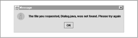
Java Foundation Classes in a Nutshell: Swing Programming Topics, page 2 Reproduced with kind permision of O'Reilly & Associates: www.oreilly.com 3.13 Double-Buffering Double-buffering is the process of drawing graphics into an off-screen image buffer and then copying the contents of the buffer to the screen all at once. For complex graphics, using double-buffering can reduce flickering. Swing automatically supports double-buffering for all of its components. To enable it, simply call the setDoubleBuffered() method (inherited from JComponent) to set the doubleBuffered property to true for any components that should use double-buffered drawing. Remember that double-buffering is memory intensive. Its use is typically only justified for components that are repainted very frequently or have particularly complex graphics to display. Note, however, that if a container uses double-buffering, any double-buffered children it has share the off-screen buffer of the container, so the required off-screen buffer is never larger than the on-screen size of the application. 3.14 The Box Container Chapter 2, Swing and AWT Architecture, discussed the general task of arranging components within containers and listed the layout managers provided by AWT and Swing. This section describes a commonly used Swing layout management technique in detail. The easiest way to create complex arrangements of Swing components is often with the javax.swing.Box container.[1] Box arranges its components into a single row or a single column. You can then use nested Box containers to create a two-dimensional arrangement of components.
The Box container uses the BoxLayout layout manager, but this layout manager is automatically assigned, so you never need to work with it explicitly. The easiest way to create a Box is with the static Box.createHorizontalBox() or Box.createVerticalBox() method. Once you have created a Box, simply add children to it. They will be arranged from left to right or from top to bottom. The unique power of the Box actually comes from an inner class called Box.Filler. This class is a simple component that has no appearance; it exists simply to insert blank space in a layout and to affect the resize behavior of the layout. You do not create Box.Filler objects directly. Instead, you create them using the following static methods of Box: Box.createHorizontalStrut(int width) Box.createVerticalStrut(int height) Box.createHorizontalGlue() Box.createVerticalGlue() If you are arranging a row of components, you can call createHorizontalStrut() to insert a fixed number of pixels of blank horizontal space. For a column of components, use createVerticalStrut() to insert a blank vertical space. The glue methods are different. They insert stretchy horizontal or vertical space into a row or column. By default, the space is zero pixels wide or zero pixels high. But, if the row or column is stretched so that it becomes wider or higher than its default size, these glue components stretch to take up that extra space. For example, say you fill a row with some horizontal glue, a JButton component, and some more horizontal glue. Now, no matter how wide the row becomes, the JButton is always centered in it. This is because the two glue components (and possibly the JButton) grow equally to take up the extra space. On the other hand, if the row consists of only one glue component followed by a JButton, the JButton always appears right justified in the row, since the glue component grows to take up all the space to the left of the button. As another example, consider a Box used in a dialog to hold a row of OK, Cancel, and Help buttons. Without any glue, the buttons are resized to fill up the entire row, with no extra space between them. If we intersperse the three buttons with four glue components, however, the buttons are always nicely spaced out and the buttons and the spaces between them grow proportionally as the dialog box becomes wider. 3.14.1 Minimum, Preferred, and Maximum Sizes In order to fully understand the behavior of the Box container and its glue, it is important to understand that Swing components can have a minimum size, a preferred size, and a maximum size. Many components have a natural size. For example, with a JButton, the natural size is the space required to accommodate the button text and/or Icon, plus the space required for the button border. By default, a JButton reports its natural size as its minimum size and as its preferred size. When asked for its maximum size, a JButton returns very large integers, indicating that it can grow to become arbitrarily wide and arbitrarily tall. Swing components (but not AWT components) allow you to specify their minimum, preferred, and maximum sizes. For example, if you do not want to allow a JButton to become arbitrarily large as its container grows larger, you can set a maximum size for it by calling setMaximumSize(). Setting a preferred size for a JButton is an uncommon thing to do, as JButton has a perfectly good natural size. But some components, such as JScrollPane objects, do not have a natural size. For components like these, it is usually important that you establish a default size with setPreferredSize(). If you want to prevent a JScrollPane or similar component from becoming arbitrarily small or arbitrarily large, you should also call setMinimumSize() and setMaximumSize(). Now that you understand the concepts of minimum, preferred, and maximum sizes, we can return to the Box container and its struts and glue. Both struts and glue are instances of the Box.Filler component. When you create a Box.Filler, you are actually specifying minimum, preferred, and maximum sizes for the component. A horizontal strut is simply a Box.Filler with its minimum, preferred, and maximum width set to the number of pixels you specify. A vertical strut has a fixed minimum, preferred, and maximum height. Horizontal glue has a minimum and preferred width of zero, but a very large maximum width. This means that the glue takes up no space by default but grows as necessary to fill up extra space. Vertical glue does the same thing in the other dimension. In order to understand glue, it is also important to understand how the Box container distributes excess space to its children. If a horizontal Box becomes wider, the extra width is allocated among the children based on their maximum widths. Children with larger maximums are given a proportionally larger amount of the extra space. When you intersperse JButton objects with glue, all the components have effectively infinite maximum widths, so all grow by equal amounts. Suppose, instead, that you restricted the sizes of your buttons like this: okayButton.setMaximumSize(okayButton.getPreferredSize()); cancelButton.setMaximumSize(cancelButton.getPreferredSize()); helpButton.setMaximumSize(helpButton.getPreferredSize());In this case, the buttons are already at their maximum sizes, so no extra space is allocated to them. Now the glue between the buttons gets all the extra space. I just said that glue components have a preferred size of zero. With regard to the example of three buttons interspersed with four glue components, this means that when the row of buttons is displayed at its default size, the buttons bump into one another and appear awkwardly crowded. To remedy this, you might place horizontal struts and horizontal glue between the buttons. In this case, the struts provide the default and minimum spacing, while the glue components make the spacing grow. There is a more efficient way to do this, however. You can explicitly create Box.Filler components that combine the nonzero default size of a strut with the infinite maximum size of a glue object. You can create such a filler object as follows: Dimension fixedwidth = new Dimension(15, 0); Dimension infinitewidth = new Dimension(Short.MAX_VALUE, 0); Box.Filler filler = new Box.Filler(fixedwidth, fixedwidth, infinitewidth); 3.14.2 The Other Dimension So far, our discussion of the Box container has covered only how components are arranged horizontally in a horizontal box or vertically in a vertical box. What does Box do in the other dimension? When laying out components in a row, the Box makes the row as tall as the tallest component and then attempts to make all the components as tall as the row. Similarly, when it lays out components in a column, Box tries to make all components as wide as the widest component. As we've discussed, however, components can have a maximum size. If a row becomes taller than a component's maximum height or a column becomes wider than a component's maximum width, the Box must decide how to position the component with respect to the others in the row or column. For a column, the component can be left, center, or right justified or positioned anywhere in between. A component in a row can be aligned along the top or bottom of the row or placed somewhere in between. A Box positions such a component based on its alignmentX or alignmentY property. Each is a float property that should have a value between 0.0 and 1.0. The default for both is 0.5. When a component needs to be positioned horizontally in a column, the Box uses the alignmentX property. A value of 0.0 means the component is left justified, 1.0 means the component is right justified, and 0.5 means the component is centered. Other values position the component appropriately between these positions. When a Box needs to position a component vertically in a row, it uses the component's alignmentY property to place the component in the vertical plane in an analogous way. 3.15 Simple Dialogs GUIs often use dialog boxes to handle simple interactions with the user. javax.swing.JOptionPane is a Swing component that is designed to serve as a highly configurable body of a dialog box. Instead of using the JOptionPane directly, however, most Swing programs use one or more of the many static methods defined by JOptionPane. These methods make it quite easy to implement simple dialog-based interactions. If you take a look at the API for JOptionPane, you'll see that the class defines a group of static methods whose names begin with show and another whose names begin with showInternal. The show methods display simple dialog boxes within JDialog windows, while the showInternal methods display the same dialog boxes inside JInternalFrame windows. These static methods are further broken down by the type of dialog they display. There are several versions of showMessageDialog(), showConfirmDialog(), and showInputDialog(), as well as showInternal versions of the same methods. We'll consider these three types of dialogs - message, confirm, and input - in the sections that follow. |


